Analysis
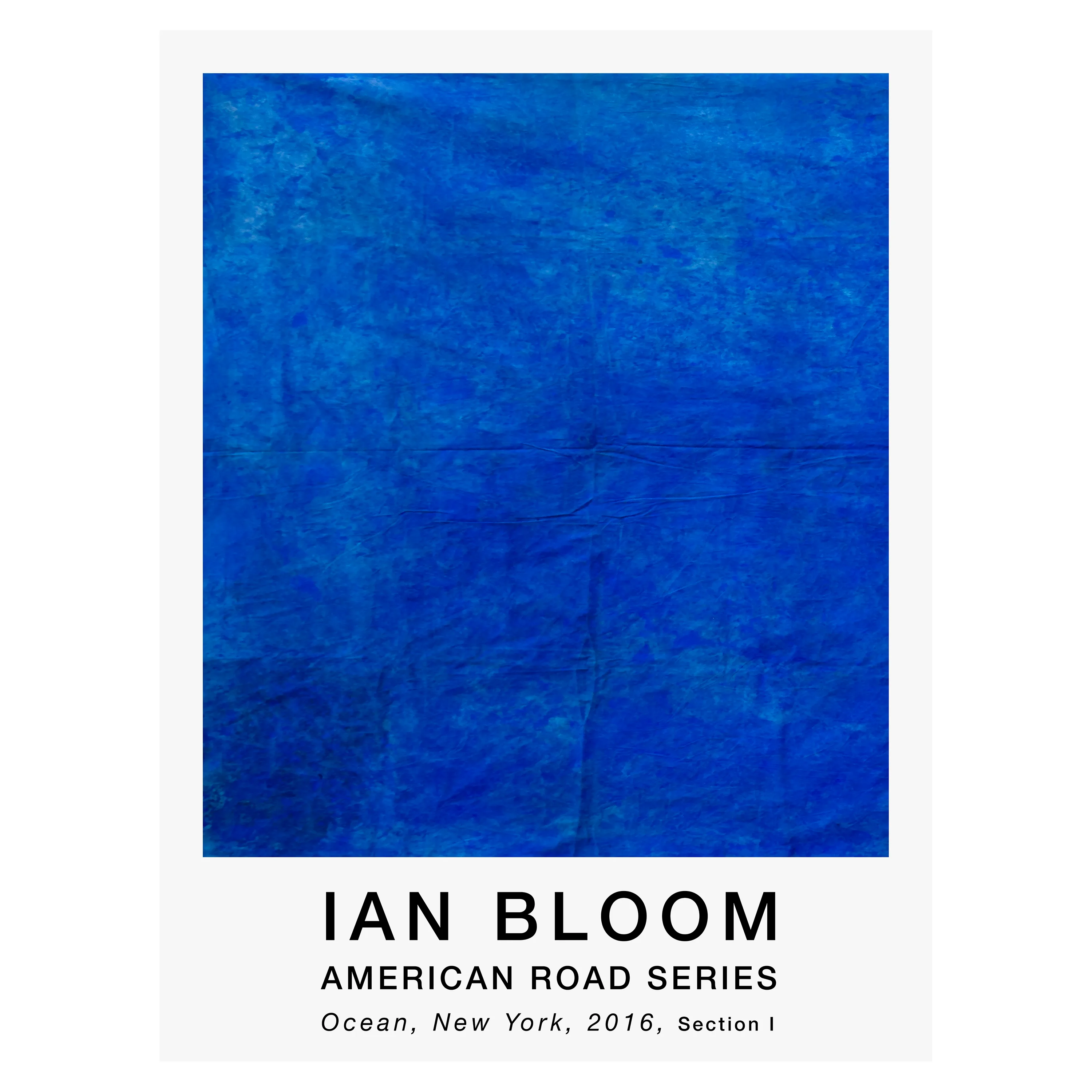
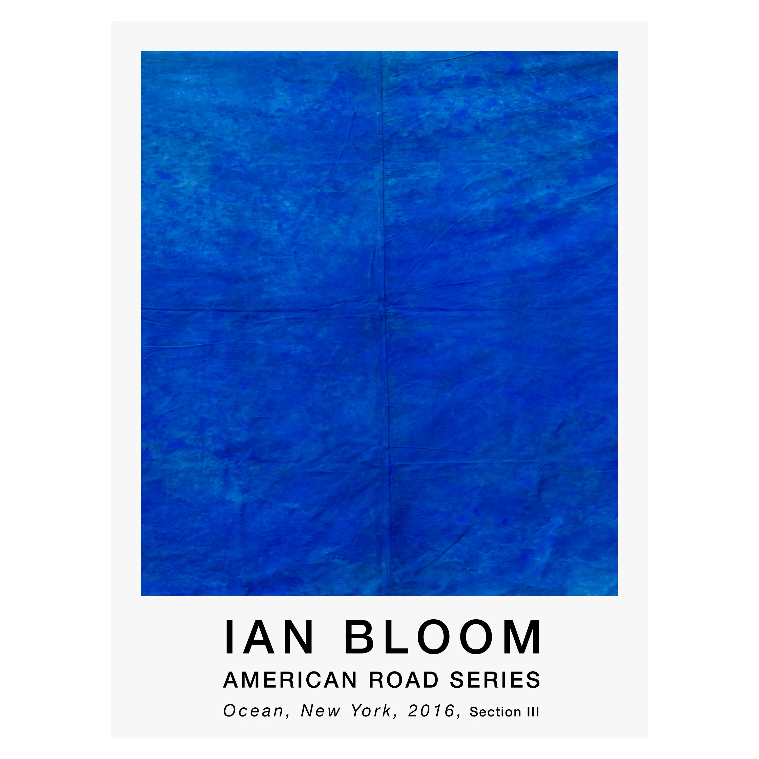
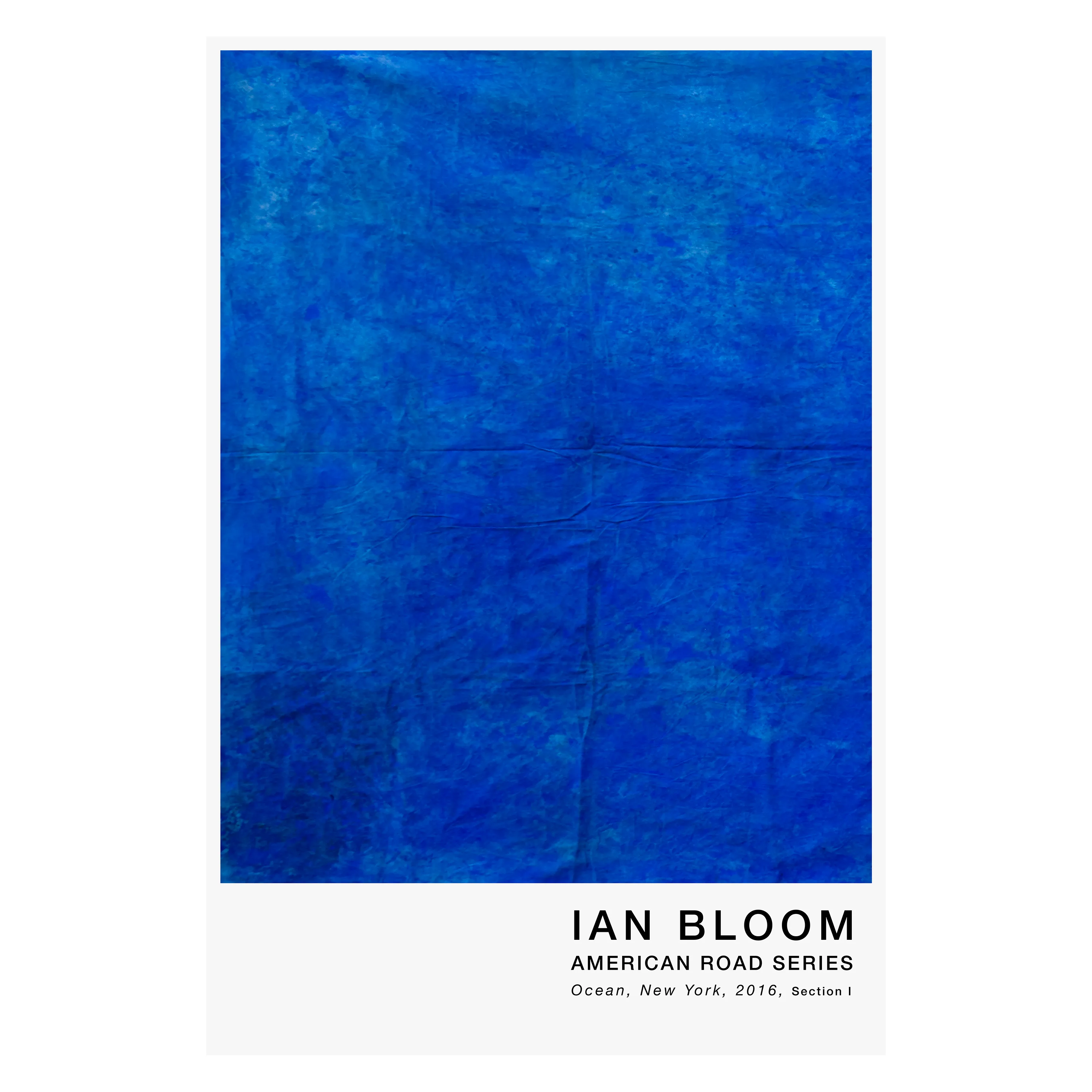
The strongest way to read Ocean is as a painting of withheld drama. It does not declare itself through opposition the way many abstractions do. There is no central eruption, no obvious fracture, no theatrical break in the field. Instead the painting asks whether a surface can remain nearly continuous and still hold pressure. The answer, here, is yes. Its force lies in duration. The longer one looks, the more the apparent calm begins to separate into depth, drag, seam, and controlled variation.
This makes the work unusually difficult in the best sense. It does not yield itself instantly. At first the blue feels total, almost absolute. But then subtle differentiations begin to appear: cooler and warmer blues, rubbed passages, faint vertical and horizontal tensions, areas where the field seems to recede and others where it presses forward. The painting behaves like a body of water only to the extent that it keeps refusing final fixation. One cannot settle it all at once.
The surface handling is crucial. Bloom has not merely laid down a blue field; he has complicated it with enough material disturbance to keep the image alive. Fine creases and linear traces cross the body of the work, some more visible where the light catches them, others almost buried. These are not incidental marks. They function as the painting's internal armature. They tell the viewer that this blue has weight, history, and resistance. Atmosphere here is disciplined by structure.
There is also a compelling refusal of rhetoric in the work. A painting titled Ocean could easily drift toward the sublime in a predictable way, vastness, mystery, transcendence, all the usual vocabulary of watery abstraction. Ocean avoids that by staying grounded in the material fact of the painted surface. Its space is real enough to draw the eye inward, but never so illusionistic that the canvas disappears. One remains aware, always, that this is paint and field, not image-space alone. That awareness hardens the work.
What makes the painting historically legible is its command of monochrome without surrendering to purity. This is not a doctrinaire monochrome. It does not seek perfection through uniformity. Instead it uses near-monochrome as a testing ground for nuance, restraint, and tonal intelligence. The blue field becomes a site where the smallest shift matters. The painting earns its authority precisely by making slightness consequential.
Its scale also matters. Ocean needs breadth because its logic depends on immersion. A smaller work might have read as an exercise in blue atmosphere. At this span, the image becomes environmental without becoming scenic. It begins to act on the viewer's body. One does not simply glance at it. One settles into it, then realizes that settling is uneasy. The work holds you there, not through aggression, but through unbroken insistence.
The title helps because it names the emotional and physical register of the work while leaving its formal ambition intact. Ocean is an apt title not because the painting imitates water, but because it shares water's deepest pictorial property: depth without stable contour. Yet Bloom's ocean is not romantic or free. It is held in place, compressed into a rectangle, made answerable to exact proportion and surface judgment. In that sense, the title names both the image and the feat performed upon it.
In the larger Ian Bloom record, Ocean is indispensable because it reveals the cool side of the 2016 cycle with unusual purity. If Fire is combustion flattened into structure, Ocean is recession disciplined into field. Together they clarify a crucial principle in Bloom's painting: opposites are not sentimental complements but formal tests. Heat and cool, strip and depth, abrasion and stillness, command and withdrawal, each becomes meaningful because the other exists. Ocean stands on its own, but it also sharpens the read of the whole canon around it.